
Disappointment and Data: A Match Made in Hell
Edit: I have since noticed you can click on various parts of the form. Extremely bad internet connections do not help in the full exploration of a web site.
When I first learned that my assignment was to peruse my way through a few Feltron Reports I was thrilled. These reports provide an absolutely ridiculous amount information in the form of graphs and charts on the life of Nicholas Feltron or New York for really little other than personal curiosity and mild amusement. This initial excitement and curiosity continued as I examined the earliest available report I could find from the year 2005. Flipping through the pages, I found the juxtaposition of the photographs and blocks of color both interesting and aesthetically pleasing. As far as statistics go, this was much closer to the painless reading of a children’s illustrated book versus a text laden, small print textbook. The orange, grey, and white scheme and the simplicity of the pages kept the graphics easy to read and the information behind them easy to deciphers. As time moved on, however, I became less and less impressed and more and more frustrated trying to decipher the reports.
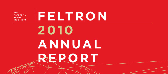
Fast forward to one of the more recent reports: the Feltron report from 2010. Just from the line filled cover alone, I immediately knew some of the elements I so much adored from the 2005 report had become history over the five years between the two reports. I was immediately disappointed at the lack of photography that had so beautifully breathed life into the numbers represented on the page. The balance between artistic distraction and factual information had certainly been disrupted. Additionally, the colors used, although more varied, were not necessarily easier to decipher. Perhaps the most irksome aspect that had developed over the five years, however, was the reduction in size and the amount of space allotted for each topic covered. While theoretically this report offers more information, it is in a sense offering less since much of it is rather difficult to see. And, as a 13 inch MacBook Pro owner with so many of my classmates owning the same piece of equipment, I know that these reports are very obviously not optimized for common screen sizes.
Furthermore, both reports disappointed my in their lack of interactivity. They are all image files wit no capability of zooming or perhaps clicking on different areas. This lack of the use and exploitation of the advantages of digital media is especially troubling when assessing how enhanced these project could be with a few relatively common technologies. Metadata could allow for search ability, also perhaps allowing for comparing two similar figures from multiple years with ease. Additionally, the use of Flash to create graphs the pop up when clicked or that perhaps include the photography element I came to adore would solve both the problem of not being able to see some of the data due to its size and the blandness of the plain reports. Finally, creating them digitally (as it implies he scans an analog copy in to provide the images used in the link above) rather than making an analog allows for them to change over the course of a year as these events are in progress, which could draw more viewers (and interest in general) as it changes daily, weekly, or monthly.
Seeing as I have some fundamental differences with Feltron in terms of the best way to display data, I turned to the FAQ section seeking answers. Luckily for me, Feltron included an entire section dedicated to the approach he took in displaying the data he collected. I immediately found fault with his response to the question “What are your key considerations when designing information graphics?” which essentially emphasizes the importance of not using many links or unnecessary design related elements. For me, I simply do not see the point in putting such work in the digital realm if this is the thought process behind it. As explored in my previous post entitled Response to The Difference Slavery Made: A Close Analysis of Two American Communities, spacial, participatory, encyclopedic, and procedural elements formed through a variety of links and included information are all absolutely key in making use of digital media – none of which I feel that Feltron fully makes use of.
Overall, although Feltron has an interesting concept, his true value in my foray into digital history lies in what he has taught me to make full use of through his neglect of the aforementioned elements. Having links, metadata, design, and interactivity are all vital tools that computer use has afforded us in our fight to make information both more interesting and more useful – and should be used to their fullest extent. While Feltron sought to avoid an overly complicated report, he instead overshot his goal and lead to a too simplistic representation of his data. With the digital realm offering so many opportunities, it is a grave sin of the digital historian community to commit such an atrocity as to create a boring, hard to read, static report.