
Probing the Past and Plural Pie Charts
While the records assembled by Probing the Past, I came across the probate records of a man by the name of Benjamin Harrison of Charles City County, Virginia who passed away in 1791. I found his records to be interesting due to the fact that almost all of the items listed under his possessions were in fact not items at all – they were all slaves. This large slave population at the hands of Harrison provides me the perfect opportunity to make point about how the same data can be portrayed and compared/contrasted in a variety of ways (even when using the same type of chart), all depending on what argument you are trying to make. Below, you will find 3 pie charts all generated from this single record:
Age
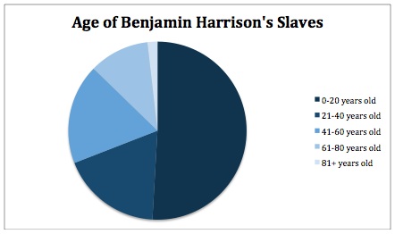
This pie chart displays the ages of Harrison’s slaves in 20 year intervals. From this chart alone, it is clear that the majority of his slaves are between 0 and 20 years old, which could be a useful point by itself depending on what you are trying to prove. One example of this would be perhaps looking at the amount of farm land or labor intensive items that Harrison owned and support that with the amount of able bodied , young to middle aged slaves at his disposal since they are more likely to be doing the bulk of hard work. Comparatively, this graph would be useful in conjunction with a similar graph for another person perhaps from another time period or area and compare the age demographic of the two slave populations. This could also be done with someone with less farm land to see and perhaps a greater need for houseworkers and see if this influences the most common age for the slave population.
Condition
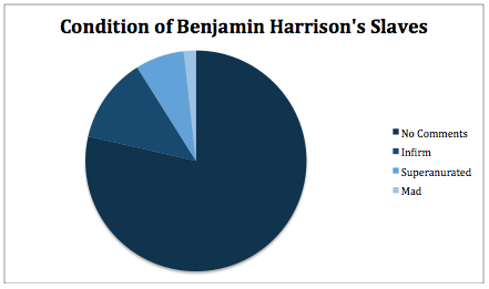
Like that chart above, this visualization is also useful on its own in order to give a portrait of the condition of Harrison’s slaves at the time of their appraisal. As we can see, the majority of his slaves were in good enough health for them to avoid any sort of negative comment on their health. This chart could be used in conjunction with a chart regarding age (such as the one above) and be repeated for another slave owner with an older slave population so either confirm or deny that the condition of the slaves is a product of their age. Additionally, if combined in a similar fashion except with a chart on the value of the slaves as seen below, an argument may be formulated on the dependency of the value of the slaves on their age. Of course, with these comparisons, it is important to keep factors such as time period and location the same, but if desired comparisons over time and throughout different counties could also be produced and paired with this chart.
Value
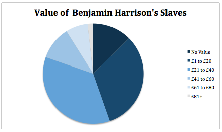
Once again, as with the previous two charts, the above chart does hold some face value. it provides a breakdown of the appraised value of Harrison’s slaves. Out of all of the charts, however, I feel that it is most important that this chart be paired with at least another chart, or preferably with another set of charts. (This information is actually probably best displayed in a chart involving two axises in order to allow for two factors to be displayed simultaneously (i.e. age and price), but is displayed in a pie graph here to prove the point how one chart and one set of data can be interpreted in a variety of ways.) This would allow for arguments to be made off of the influence of age or the influence of condition of the price of the slaves, which could be strengthened through the addition of more pairs of charts with one factor drastically changed. For example, using the above graphs of the value of the slaves and the breakdown of their ages and comparing them to a similar set of charts for a person in the same county (meaning the price should be about the same) with significantly older slaves would give a solid answer to the effect age has on a slave’s price.
Why does this variety matter?
What I am trying to prove here is that even if you are stuck with one set of data, all hope is not lost for adopting an interesting perspective. As you can see here with just three charts, there is a variety of ways to contrast and compare the data, especially when combined with other similar version of data (in this case, other people). Beyond that, the fact that all of these different subsets of the original data can be displayed in similar graphs allows for each comparison at a glance. Keeping things uniform, whether through color or form, is highly important in getting your point across with minimal effort on the part of the reader. As Professor Cohen would say, its something out “lizard brains” can keep up with. Happy charting everyone!
(Note: A lot of the data presented here would work (possibly even better) when combined or even displayed alone in a different type of chart. Don’t think pie charts are always the solution! Just give me a break since time certainly isn’t something a college student comes by easily.)