
9/11 as Seen Through Wordle, Ngram, and Voyant
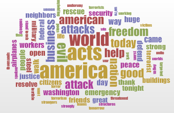
For today’s post, I decided to take the same event and process through some of the various programs that have been brought up in discussion recently. Sticking with the theme of my PowerPoint from a few posts ago, I decided to continue my examination of the 9/11 terrorist attacks. In particular, I decided to analyze this speech given by George W. Bush on the same day of the attacks. To begin, I created a “wordle” using the entirety of the speech with common American English words excluded, thus yielding the visualization seen below:

From this, it is clear that the focus of Bush’s speech was America. Other than that? Not much. Given only this wordle, I doubt that many people would be able to pinpoint is source and take quite a while to establish 9/11 as the event being addressed, only after finding telltale words like “airplanes.” Additionally, though the different sizes present are supposed to indicate the frequency at which a word appears, the font becomes so small that it is hard to read. Overall this visualization truly holds little value other than aesthetics. Perhaps its best use is potentially being tacked on a PowerPoint while the speaker does the majority of the work in giving actual information. Next I decided to turn to Voyant‘s somewhat similar (but mostly different) version of what is seen above, the results of which can be found below:
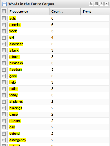
As you can see, Voyant gives you much more information in addition to a wordle style visualization. Though this visualization may not wind up as being appropriate for the topic due to the inflexibility of the colors and fonts used, it Voyant does have other features that make up for this category. By having specific word counts, Voyant takes much of the guesswork out of how many times a word was actually used, as wordle makes the user guess based on font size alone. Additionally, in the full Voyant results page, a very detailed breakdown of word usage is also offered. Some problems, however, still exist. Voyant will not give you results that you can easily display, whether due to design issues or not offering a visually pleasing, easily recordable output. Additionally, other than word frequency, this gives you very little to go on. While it may give you the major themes of the document, there is only so much analysis that can be based upon the information provided.
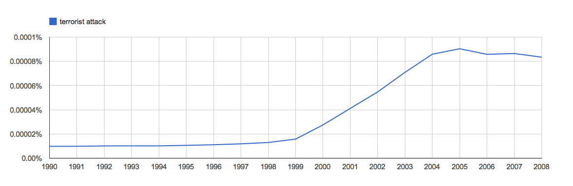
Finally, I decided to move on to Google’s Ngram viewer, which displays word usage frequency over time based off of the Google Books collection. In this case, I decided to use the words “terrorist attack” as I feel that this phrase was and is used frequently to describe this event, the results of which can be seen below. Though the rise in the phrase’s usage occurs slightly before the 9/11 attacks, the dramatic continuing rise after the attacks seems to indicate that they did have an impact on the usage frequency of this phrase. This offers much more insight into political climate before an after the event compared to any visualization above. Although it does not give us a breakdown of the words used, it provides even more valuable insight into the event. While this sort of representation for information is prone to have problems with sourcing, language divides, and context, the fact this this is a modern event that is likely to have a lot of print material primarily in English and that it fits the proper dates indicates that in this particular case it is an effective tool (although it may not be for other topics).
Overall, most of these visualizations give very little information for the viewer to go off of, especially when it comes down to truly valuable information. While this may mean that these visualizations (for the most part) don’t belong when you’re trying to prove a point, they certainly have a place as a sort of “eye candy” piece that requires some (or a lot) of contextualization to make it make sense. Out of these, Google’s Ngram viewer come out on top due to the context that it does indeed provide by displaying the date, the words used, and their frequency. The important thing to remember here is not to rely on these visualizations to make you point for you, as it is often better accomplished trough oral or written context or other types of graphs and charts.