The Perils of Power Point
I went into the reading assignment this week expecting the fairly typical explanation of different ways of presenting digital media and a specific list of concerns. Instead, I got this (PowerPoint is Evil) and this (The Gettysburg PowerPoint Presentation). While both are humorous, they do make good points on how slideware programs more frequently than not create a presentation that is distracting, misleading, and even irrelevant. With all the talk how “how could we live without this?” few people actually consider what the actual answer to that question is.
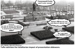
Lets start with the first article entitled PowerPoint is Evil – with even the title being short, sweet, and to the point. In this article, author Edward Tufte expresses his extreme distaste for slideware programs like PowerPoint, citing their length versus the amount of actual information they contain and their propensity to come off a sales pitches. Given my years a student forced to endure PowerPoint after PowerPoint I absolutely concur with the points made by the author, even if his are slightly more satirical in nature. Perhaps the most alarming feature of the entire article is the point made about school children who were assigned a 3-6 slide presentation. The end result of the assignment, according to Tufte, is a mere 80 words (15 seconds of silent reading) for an entire week’s worth of work.
Following this train of thought, Tufte applies the same logic to the adult workplace. Since a typical PowerPoint slide only displays about 40 words (8 seconds of silent reading material), nearly any type of information is going to take several slides to cover. This subverts the number one reason people turn to PowerPoint – simplifying information in order to present it quickly and clearly. Why are we bent on using such a complicated method to display our information? Perhaps it is because we feel that it gives our presentation something tangible for people to take in. This brings me to the second link I initially presented you with.
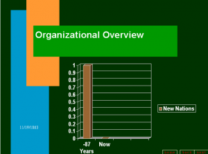
Look familiar? It is the Gettysburg Address…in is most horrid form. Between the distracting colors, unnecessary graph, and inevitable technical difficulties and delays, the speech (even though the content is virtually the same) is greatly weakened. For those of you who are inclined to use PowerPoint as a sort of crutch while presenting, this example should make you think twice. Powerpoint often detracts from the power of words and takes away much of the listener’s attention away from the content that really matters. It is clear that, at least in this situation, the PowerPoint presentation takes away much more than it gives.
While this entry suggests that the best thing to do with PowerPoint is to uninstall in from computers everywhere, its popularity and lack of alternatives make the program a member of the necessary evil category. This raises the question, what can be done to optimize use of slideware programs? I suppose the best advice I can give is that of my 12th grade Theory of Knowledge teacher’s lecture on PowerPoints. Use high contrast and a reasonable font size. Keep the focus on what you’re saying an not whatever crazy animation you can stick on your slide. If your audience needs to write something down and it needs to be spelled correctly, include it. If you need to reference a diagram, use it. Other than that, don’t include much. And most importantly, don’t rely on reading your PowerPoint – learn to use the power of words.
Do you have any good PowerPoint alternatives? Let me know in the comments!


Leave a Reply