September 11th, 2001 – A Day I Will Never Forget
This week’s task was to optimize the use of slideware program when given only 3 slides to cover one moment from history. As an American citizen born in the mid-1990s, one of the most significant historical events in my mind is the terrorist attacks on September 11, 2001 – exactly what I chose to focus my efforts on for this assignment. My goal here is not necessarily to provide all of the information about the attacks, but to simply combine first-hand observations in the form of quotes and a timeline of events. When it comes to wars and other historical events, we tend to think of them as drawn out – sometimes lasting years – but 9/11 truly changed international relations and the United States greatly in just a matter of hours. The aim here is to show how the impact of 9/11 was spread over such a short amount of time and how quickly it was realized that this would not be an easy event to recover from. Below, I will break down my presentation into individual slides but a full slideshow version can be found here.
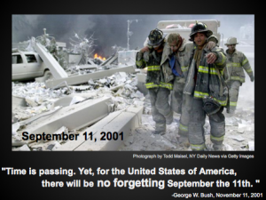
My rationale here is simple: what can I do to make both have an introduction and set the tone for the presentation all in one slide? Given only 3 slides to work with, this combination was key. I quickly turned to the old adage “a picture is worth a 1,000 words” and found an image that I feel represents the emotional and tangible damage done on that day. With the addition of the words “September 11, 2001” I solidify the viewers understanding of the event being portrayed. I then chose to add a quote reiterating the same point. This allows the audience to be brought emotionally into the information I am portraying as they also have an item to focus on while I introduce the presentation verbally.
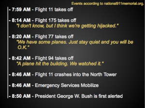
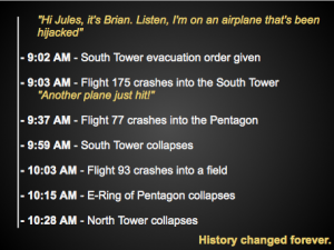
The next two slides, shown above, are a timeline of events complete with quotes situated between the proper events. My initial plan was to only dedicate one slide to this sort of information, but I encountered two problems. Initially, my last slide was going to be a heat map of the United States based on how many emergency responders came from each state to help with the aftermath to show how truly national the response was. Unfortunately, I was not able to find any of this information in time (despite absolutely frantic Google searching and other information gathering methods). Additionally, the timeline would be too crowded had it been squeezed into one slide. This arrangement allows the information to be more easily viewed if it were displayed via projector and allows each point enough space to where it holds a certain amount of importance.

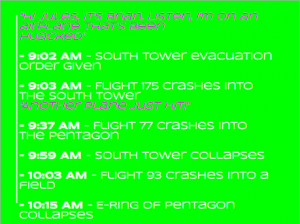
This version simply does not fit stylistically with the content being displayed, as well as contains some formatting errors. Both of these factors detract from the information being presented and the speaker.
One important decision I had to make was what program to use to create the slideshow. In this case I chose Google Drive‘s presentation feature since it was free, easy to use, and allowed me to display the slideshow via a link with ease. Other decisions involved in the creation of this slideshow include color choices. I clearly wanted something that was both high contrast and serious. Black, yellow, and white fit the criteria exactly. I also made the distinction in the font between the quotes and the timeline in order to emphasize their differences. The timeline is displayed in a simple font with no color as it is comprised of concrete information, barring the emotional aspects of the event. The quotes are then displayed in italic yellow font as I wanted to both highlight their importance in gaining a true understanding of the event and also distinguish them as less concrete. Finally, I made the decision not to use any preset slide layouts and instead start with a blank slide each time.


Leave a Reply